6. Better in Green

Brief
Create a visual identity for the new green initiative by ShopTalk London, named ‘Better in Green’.
Services: Brand Identity, Tone of Voice, Digital Design, and Motion Design
Concept
The identity proposal for ‘Better in Green’ showcases a logomark based design which aims to have a close relation with the new green initiative set by ShopTalk.
With this approach, the identity proposed has an element of authority towards it and which can see it being used as a ‘stamp’ of approval, and adapted for different platforms, depending on the intentions of the user.

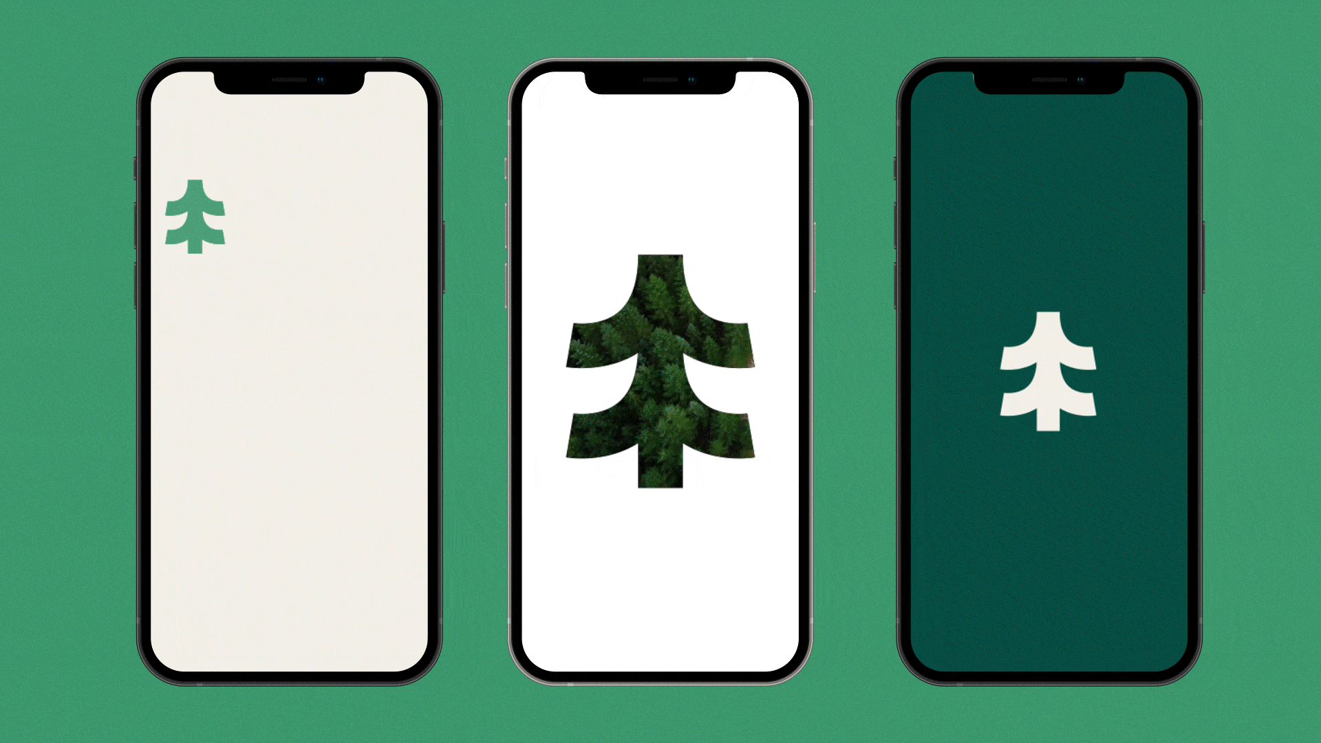
Logomark
The full logomark keeps true to the theme of Better in Green, by using a typeface which is clear and distinguishable. The typeface also supports the additional curves within the main graphic mark, with the curvature within the capitalised ‘G’.
Social Media Presence
The social media assets for Better in Green have the ability to take three different forms; using the graphic mark as an icon, a window for imagery based posts and stories and a graphic mark which can be used as a authorative stamp.
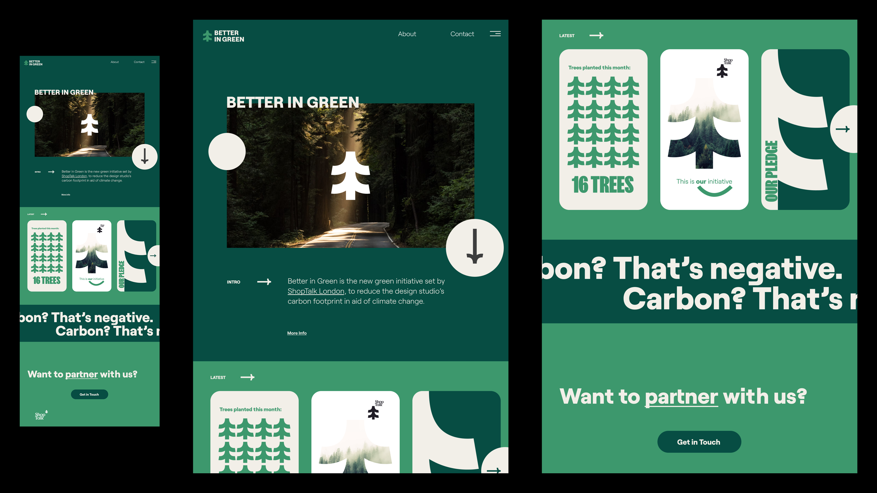
Landing Page
The landing page for Better in Green will be situated away from the ShopTalk website and will act within its own space. This will take form in a reductive website with information being at the forefront of the design approach, in order to have the key information be the focal point for the Better in Green initiative.